Betty Develops
Betty Udvikler
THE CREATIVE PROCESS
THE CREATIVE PROCESS
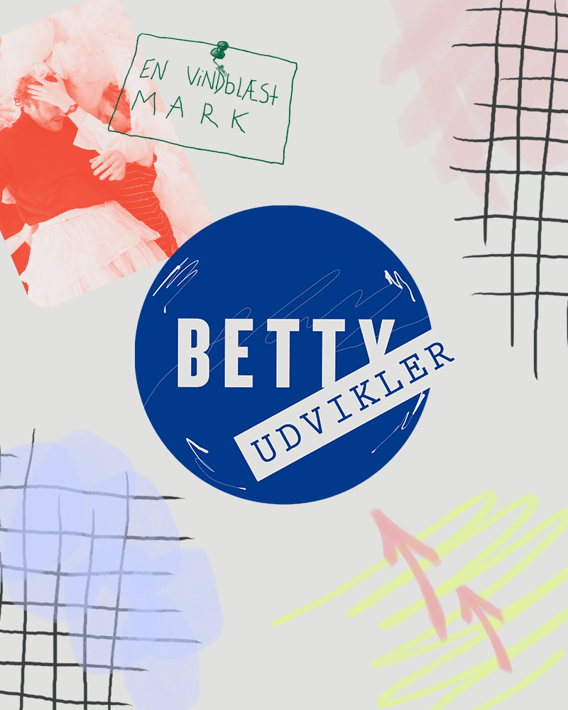
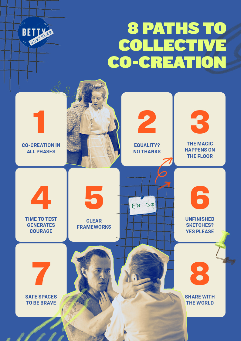
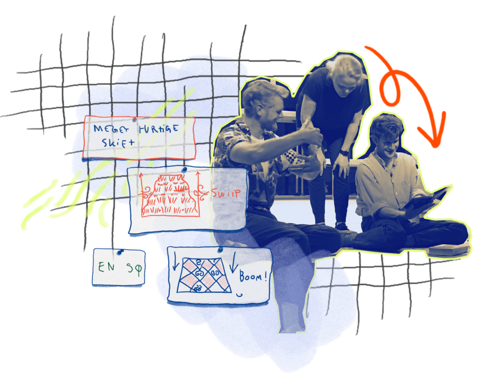
The Betty Nansen Theatre in Copenhagen has a department dedicated to the develop and improve the creation of their plays. The department is called Betty Udvikler (Betty Develops) and I had the honour of making their new visual identity. One of their biggest values is co-creation which was an important inspiration for how this turned out. They're strive to be creative, inclusive and experimenting, and I visualised this creative, but controlled chaos with a sketchy illustration style, lots of colours and mixed media.
The Betty Nansen Theatre in Copenhagen has a department dedicated to the develop and improve the creation of their plays. The department is called Betty Udvikler (Betty Develops) and I had the honour of making their new visual identity. One of their biggest values is co-creation which was an important inspiration for how this turned out. They're strive to be creative, inclusive and experimenting, and I visualised this creative, but controlled chaos with a sketchy illustration style, lots of colours and mixed media.

LOGO UPDATE
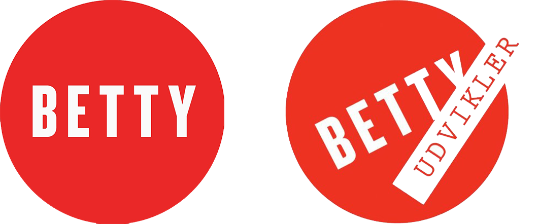
The theatre already had a logo for Betty Develops - the one in the middle. However, it was a bit too much of a clone of their overall logo - the one on the left - so they asked me to create a less corporate version with a distinctive colour so Betty Develops wouldn't be confused with the theatre in general. To do so I added some handdrawn scratches, tweaked the text and put it on a deep blue coloured circle - and I think it kind of proofs that blue isn't necessarily a corporate colour by default.
A BIG TOOLKIT
The identity is mainly used on their social media and on their own blog, so it was a priority of mine to create a broad colour palette, different ways of cutting out pictures and many, many handdrawn elements so their posts wouldn't look all the same across their site while they still fit wihtin the Betty Develops' universe.
